Choosing the perfect color scheme can be a game-changer. Whether you’re redecorating your home, picking out a new wardrobe, or working on an art project, the right colors make a big difference. Colors set the mood and create a sense of harmony. They can make a space feel cozy or energizing, professional or playful. In marketing, a well-chosen color scheme can boost your conversion rates by 1-5%, which shows how crucial the right colors can be.
This blog post will provide you with ten essential tips for choosing the perfect color scheme. These tips will help you make informed choices, ensuring that your colors work together beautifully. Whether you’re choosing colors for your living room, your clothing, or your entire home, these guidelines will make the process easier and more enjoyable.
Why Choosing the Perfect Color Scheme is Important
Table of Contents
Choosing the perfect color scheme is crucial. Colors impact our mood and perception. They can make us feel calm, energized, or even hungry. For example, blue often creates a sense of calm, while red can increase excitement and appetite.
In-home decor, the right colors make a room feel inviting or spacious. A well-chosen color scheme can transform a dull space into a cozy retreat or a lively gathering spot. For your living room, using colors like soft greens and blues can create a relaxing environment, perfect for unwinding after a long day.
When it comes to clothing, colors play a big role too. The colors you wear can boost your confidence and express your personality. For instance, wearing bright colors can make you feel more lively, while neutral tones can project professionalism. Knowing how to choose your color palette for clothing helps you build a versatile wardrobe that suits different occasions and moods.
Interior design also benefits from a thoughtful color scheme. A harmonious palette ties different rooms together and creates a cohesive look. This is important in open-plan homes where one area flows into another. By using a consistent color palette, you ensure that each room complements the others, enhancing the overall aesthetic of your home.
Art is another area where colors matter immensely. Artists use color to convey emotions and messages. A well-chosen color palette can make a drawing or painting more engaging and powerful. If you know how to choose a color palette for a drawing, you can better express your creative vision.
How Do I Choose the Right Color Scheme?
Choosing the perfect color scheme starts with understanding color theory. This is the study of how colors interact with each other. It helps you choose colors that look good together. The color wheel is a simple tool that shows these relationships.
One basic concept in color theory is complementary colors. These are colors that are opposite each other on the color wheel, like red and green or blue and orange. When used together, they create a vibrant look. For example, a room with blue walls and orange accents can feel lively and energetic.
Analogous colors are another important concept. These are colors that are next to each other on the color wheel, like blue, blue-green, and green. They create a harmonious and pleasing look. An example is using shades of blue and green in a bedroom to create a calm and serene environment.
A triadic color scheme uses three colors that are evenly spaced around the color wheel, like red, yellow, and blue. This creates a balanced and vibrant look. For instance, using these colors in a playroom can make the space feel fun and lively.
A color palette generator can be a great tool for inspiration. These online tools help you see how different colors look together. They can suggest color combinations you might not think of on your own. Simply input one color, and the generator will show you several schemes based on color theory principles.
By understanding the basics of color theory and using tools like a color palette generator, you can choose the right color scheme for any project. Whether you are decorating a room, designing a piece of art, or picking out an outfit, these principles will help you create a harmonious and appealing result.
Assess Your Preferences and Goals
When choosing the perfect color scheme, start by assessing your preferences and goals. This helps ensure the colors you pick reflect your taste and meet your needs.
First, think about your personal preferences. What colors do you love? What colors make you feel happy, calm, or energized? Pay attention to the colors you are drawn to in your daily life. Look at your clothes, favorite art pieces, and other items you own. This can give you a good idea of your color preferences.
Next, consider the purpose and setting for the color scheme. Are you choosing colors for a bedroom, a living room, or an office? Each space has a different function and mood. For example, a bedroom should feel relaxing, so soft, muted colors might be best. A living room, but, can be more lively with brighter colors. Think about how you want each space to feel and choose colors that match that mood.
Also, test the existing elements and their colors. Look at the furniture, flooring, and other items already in the space. These elements can guide your color choices. If you have a dark wood floor, choose lighter colors for the walls to create contrast. If you have a bold-colored sofa, consider using it as a focal point and choosing complementary colors for the rest of the room.
By identifying your personal preferences, considering the purpose and setting, and evaluating existing elements, you can choose a color scheme that suits your style and needs perfectly.
How to Choose Your Color Palette for Clothing
Choosing the perfect color scheme for your wardrobe can transform your style. It helps you build a versatile collection of clothes that look great together and suit your personality.
Start by thinking about your skin tone. Different colors complement different skin tones. If you have a warm skin tone, colors like red, orange, and yellow, and warm shades of brown and green will look great on you. For cool skin tones, try blues, greens, purples, and cool shades of pink and red. Knowing your skin tone helps you pick colors that enhance your natural beauty.
Personal style is also crucial when choosing a color palette for clothing. Think about what colors make you feel confident and happy. Do you prefer bold, bright colors, or do you lean towards neutral tones? Your wardrobe should reflect your personality. If you love bright colors, don’t be afraid to incorporate them into your outfits. If you prefer a more subdued look, choose neutral colors like black, white, gray, and beige.
Building a versatile wardrobe means choosing colors that can be mixed and matched easily. Start with a base of neutral colors. These can be paired with almost anything. Then, add a few accent colors that you love. For example, a wardrobe with black, white, and gray as base colors can be spiced up with accents of red, blue, or green. This way, you can create many different outfits with a limited number of pieces.
Here are some examples of successful color combinations:
- Classic and timeless: Black, white, and red. This combination is bold and elegant.
- Soft and calming: Blue, white, and beige. These colors create a serene and relaxed look.
- Bold and vibrant: Orange, blue, and navy. This combination is energetic and fun.
Choosing the perfect color scheme for your clothing makes getting dressed easier and more enjoyable. It ensures that you always look your best, no matter the occasion.
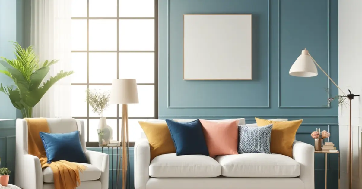
How to Choose a Colour Scheme for Your Living Room
Choosing the perfect color scheme for your living room is essential. This space is often the heart of your home. It’s where you relax, entertain guests, and spend quality time with family. Thus, the colors you choose should create a welcoming and comfortable atmosphere.
Start by understanding the importance of the living room as a central space. This room sets the tone for the rest of your home. It should reflect your style and make everyone feel at ease. A well-chosen color scheme can make the room look spacious, cozy, or vibrant, depending on your preference.
To balance comfort and style, consider the mood you want to create. Soft, neutral colors like beige, gray, and white can make the room feel calm and elegant. These colors are versatile and can be updated with different accessories. If you prefer a more lively atmosphere, try incorporating bold colors like red, blue, or green. These colors can add energy and personality to the space.
One useful guideline for choosing a living room color scheme is the 60-30-10 rule. This rule helps you create a balanced and cohesive look. Here’s how it works:
- 60% of the room should be a dominant color. This is usually a neutral or base color that sets the tone. It could be the color of your walls, large furniture pieces, or a big rug.
- 30% of the room should be a secondary color. This color supports the dominant color and adds interest. It can be used for smaller furniture, curtains, or accent walls.
- 10% of the room should be an accent color. This color adds a pop of interest and should stand out against the dominant and secondary colors. Use it for pillows, artwork, or decorative items.
For example, if you choose beige as your dominant color, you might add a soft blue as your secondary color and touches of orange as your accent color. This creates a harmonious and appealing room.
How to Choose Color Palette for Interior Design
Choosing the perfect color scheme for interior design is essential for creating harmony and flow between rooms. When colors work well together, your home feels more cohesive and inviting.
Start by considering the importance of harmony and flow. Each room should have its unique look, but they should all connect through a consistent color palette. This means selecting colors that complement each other and create a seamless transition from one space to another. For example, if your living room has soft blues and grays, you might use similar tones in the adjoining dining room to maintain a cohesive feel.
When choosing colors for interior design, it’s helpful to think of base, accent, and highlight colors. Here’s how to approach each:
- Base Colors: These are the primary colors in your palette and cover large areas like walls and floors. Choose neutral tones like white, beige, or gray for a versatile foundation. These colors provide a calm background that allows accent and highlight colors to stand out.
- Accent Colors: These colors add depth and interest to your design. Use them for furniture, rugs, or curtains. Accent colors should complement your base colors. For instance, if your base color is gray, consider accents in shades of blue or green to add a touch of color without overwhelming the space.
- Highlight Colors: These are the boldest colors in your palette. Use them for decorative items like pillows, artwork, or vases. Highlight colors should pop and draw attention. If your base is neutral and your accent is soft blue, a bright yellow or coral could be a great highlight color to add vibrancy.
Mood boards are an excellent tool for interior design. They help you visualize how different colors and elements will look together. To create a mood board, gather samples of your chosen colors, fabrics, and textures. Arrange them on a board or a digital platform to see how they interact. This process helps you refine your color palette and ensures that all elements work well together before making any permanent changes.

How to Choose a Color Palette for a Drawing
Choosing the perfect color scheme is crucial when it comes to drawing. Colors play a significant role in artistic expression, helping to convey emotions and set the tone for your work. The right color palette can make your drawing more impactful and engaging.
First, understand the importance of color in artistic expression. Colors can evoke feelings and create an atmosphere. For instance, warm colors like red, orange, and yellow often evoke feelings of warmth and happiness. But, cool colors like blue, green, and purple can create a sense of calm or sadness. By choosing your colors, you can control the mood of your drawing and communicate your intended message more.
When choosing the perfect color scheme for your drawing, think about the mood and message you want to convey. Start by selecting a dominant color that captures the essence of your work. For example, if you want to create a peaceful landscape, you might choose a calming blue or green as your dominant color. Then, add complementary colors to enhance the look and feel. If your dominant color is blue, you could add touches of warm colors like orange or yellow to create a balanced composition.
Using examples of effective color palettes from famous artworks can also inspire you. Look at Vincent van Gogh’s “Starry Night.” The dominant colors are deep blues and purples, creating a dreamlike and tranquil mood. The swirling patterns and bright yellow stars add energy and contrast, making the painting come alive. Another example is Claude Monet’s “Water Lilies.” The soft blues, greens, and pinks create a serene and harmonious scene, capturing the peacefulness of a water garden.
Experiment with different combinations to find what works best for your drawing. Don’t be afraid to try unconventional palettes, as they can lead to unique and striking results. Use a color wheel to help you understand which colors work well together. Analogous colors, which are next to each other on the color wheel, often create a harmonious and pleasing effect. Complementary colors, which are opposite each other, can add vibrancy and contrast.
How to Choose a Color Palette for Your Home
Choosing the perfect color scheme for your home can transform its look and feel. A cohesive color palette ties everything together, making your home more inviting and harmonious.
Start by creating a cohesive look throughout your home. Begin with a neutral base color. This could be a shade of white, beige, or gray. Neutral colors provide a versatile foundation and make it easy to add accent colors. Use this base color in most of your main living areas. It creates a sense of unity and flow.
Next, consider the natural light in each room. Light affects how colors look. A room with plenty of natural light can handle darker, bolder colors. In contrast, a room with little natural light benefits from lighter shades. For example, a sunlit living room might look stunning with rich blues or greens. Meanwhile, a dim hallway could feel more open with light yellows or soft pastels.
Room size is another important factor. Dark colors can make small rooms feel even smaller. Lighter colors can make them appear larger and more spacious. In large rooms, you can experiment with darker or more vibrant colors without overwhelming the space.
Transitioning colors between rooms is key to maintaining a cohesive feel. Use a consistent base color and introduce new accent colors in each room. For example, if your living room is primarily beige with blue accents, you might carry the blue into the dining room as a base color and add green accents. This approach creates a smooth flow and connects the spaces visually.
Accent walls are another great way to transition colors. Choose one wall in a room to paint a different color. It adds interest and helps bridge the color scheme from one room to the next. For instance, a deep red accent wall in the kitchen can complement a neutral living room while adding warmth and energy.
How Do I Decide My Color Palette?
Choosing the perfect color scheme can feel overwhelming with so many options available. However, you can follow practical steps to narrow down your choices and find the best palette for your space.
Start by thinking about the mood you want to create. Do you want a room to feel calm and serene or vibrant and energetic? For a peaceful atmosphere, choose soft blues, greens, and neutrals. For a lively feel, opt for bold colors like red, yellow, and orange. Knowing the mood you want helps you focus on a specific range of colors.
Next, gather inspiration. Look at magazines, websites, and social media for color schemes that catch your eye. Pay attention to rooms or spaces that appeal to you. Save these images and look for common color themes. This can give you a clear idea of what colors you are drawn to.
Once you have some ideas, it’s important to test these colors in your own space. Colors can look very different depending on lighting and surrounding elements. Get sample paints or swatches and apply them to small areas of your walls. Observe how they look at different times of the day and under various lighting conditions. This helps you see how the colors will actually appear in your room.
Visualization is also key when choosing the perfect color scheme. Imagine how the colors will look with your existing furniture and decor. Consider how they will flow from one room to another. A color that looks great in isolation might clash with the rest of your home. Visualizing the entire space ensures that the colors work well together.
Digital tools can be a big help in this process. Many apps and websites allow you to preview color schemes on photos of your own rooms. Upload a picture of your space and experiment with different colors. These tools can give you a better idea of how the final result will look without the mess of physical samples.
Understanding the 60-30-10 Rule
Choosing the perfect color scheme becomes easier when you understand the 60-30-10 rule. This rule helps you create a balanced and harmonious look in any space.
The 60-30-10 rule is a simple guideline for color distribution. It suggests that 60% of the room should be a dominant color, 30% a secondary color, and 10% an accent color. This ratio creates a balanced look that is pleasing to the eye.
To start, choose your dominant color. This color will cover the largest area, like walls and large furniture pieces. For example, in a living room, you might choose a soft beige or light gray as the dominant color. These neutral shades create a calm and versatile background.
Next, select a secondary color that complements the dominant color. This will cover 30% of the room, including smaller furniture, textiles, or accent walls. If your dominant color is beige, you might choose a rich navy or a soothing green as the secondary color. This adds depth and interest to the room.
Finally, pick an accent color that stands out and adds a pop of excitement. This color should make up 10% of the room, used in accessories like pillows, artwork, and decorative items. For example, if your dominant color is beige and your secondary color is navy, a bright yellow or vibrant red could be your accent color. This small but impactful use of color draws attention and completes the look.
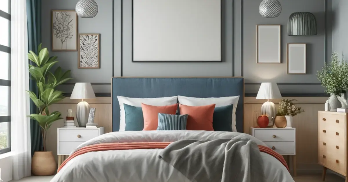
Applying the 60-30-10 rule in different settings can be simple. In a bedroom, you might have soft blue walls (60%), white bedding and furniture (30%), and coral accents (10%). In a kitchen, you could use white cabinets (60%), gray countertops and backsplash (30%), and teal accessories (10%).
Adapting the 60-30-10 rule to your personal preferences is also important. If you love bold colors, you can still follow the rule but choose more vibrant shades. If you prefer a more muted palette, stick with softer tones. The key is to maintain the balance that the rule provides while reflecting your style.
Understanding and using the 60-30-10 rule helps in choosing the perfect color scheme. It ensures that your space is well-coordinated and appealing. By following this guideline, you can create a room that looks designed and feels right for you.
How to Pick a Color Scheme for Your House
Choosing the perfect color scheme for your house involves both exterior and interior coordination. This ensures your home looks cohesive and appealing inside and out.
First, consider the importance of coordinating exterior and interior colors. The colors outside your home set the first impression. They should complement the interior to create a unified look. When guests enter, the transition from outside to inside should feel seamless. This harmony enhances the aesthetic of your home.
To begin, think about colors that enhance curb appeal. The exterior colors should make your house stand out while fitting in with the surroundings. Neutral shades like white, beige, and gray are timeless and popular. They provide a clean, classic look. You can add interest with accent colors on doors, shutters, and trim. For example, a bright red or deep blue front door can create a striking focal point.
Consideration of regional and architectural styles is also crucial. Different regions have distinct styles influenced by climate and culture. In coastal areas, lighter colors like soft blues, greens, and whites are common. These colors reflect the sea and sky, creating a relaxed, beachy feel. In contrast, desert regions often feature earthy tones like terracotta, sand, and sage green. These colors blend with the natural landscape, creating a harmonious look.
Architectural style plays a significant role in choosing the perfect color scheme. Traditional homes often look best with classic colors. Think of colonial homes with white exteriors and black shutters. Victorian houses, with their intricate details, can handle more varied palettes, including bold and contrasting colors. Modern homes, with their clean lines, often use monochromatic or neutral schemes to highlight architectural features.
When picking a color scheme, use tools like paint samples and digital visualizers. Apply small patches of color to see how they look in different lights and times of day. Digital tools allow you to upload a photo of your house and try out different color combinations.
More Tips for Choosing the Perfect Color Scheme
When choosing the perfect color scheme, it’s important to keep some more tips in mind. Avoiding common mistakes, being flexible, and making confident choices will help you achieve the best results.
First, be aware of common mistakes. One frequent error is choosing too many colors. While variety can be good, too many colors can make a space feel chaotic and overwhelming. Stick to a few well-chosen colors that work well together. Another mistake is ignoring the impact of lighting. Colors can look different in natural and artificial light. Always test colors in different lighting conditions before making a final decision. Additionally, avoid choosing colors in isolation. Consider how each color fits into the scheme and interacts with other elements in the room.
Flexibility is also crucial when choosing the perfect color scheme. Your initial ideas might not always work as planned. Be open to change and willing to adjust your choices as needed. Sometimes, a color that seemed perfect in theory might not look right in your space. Don’t be afraid to try different shades or combinations until you find what works best. Flexibility allows you to create a harmonious and pleasing result.
Making confident color choices involves trusting your instincts and preferences. While it’s helpful to seek advice and inspiration, your home should reflect your personal taste. Choose colors that make you feel happy and comfortable. Confidence in your choices will make your space feel more authentic and unique. Remember, you are the one who will live with these colors, so rank what you love.
Choosing the perfect color scheme requires attention to common mistakes, a willingness to be flexible, and confidence in your decisions. By keeping these tips in mind, you can create a beautiful and harmonious space that reflects your style and personality.
Case Studies and Real-Life Examples
Choosing the perfect color scheme can be inspired by real-life examples. Let’s look at some successful color schemes and understand why they work so well.
In one example, a homeowner chose a coastal color scheme for their beach house. The dominant color was soft blue, which evoked the calmness of the ocean. White was used as the secondary color, creating a clean and fresh look. Accents of sandy beige and light coral added warmth and interest. This scheme worked because it reflected the natural surroundings and created a serene and inviting atmosphere. It showed how using colors from nature can enhance the beauty of your home.
Another successful example is a modern loft in the city. The owner chose a monochromatic color scheme with various shades of gray. The dominant color was a medium gray, used on the walls and large furniture pieces. Lighter grays served as the secondary color for smaller furniture and textiles. The accent color was a bright yellow, used on accessories like pillows and artwork. This scheme was effective because it created a sleek and sophisticated look. The yellow accents added a pop of color, preventing the space from feeling too cold or sterile.
In a traditional home, a classic color scheme was used to highlight the architectural details. The dominant color was a rich cream, covering the walls and providing a warm backdrop. The secondary color was a deep burgundy, used on the curtains and some furniture pieces. Gold accents added a touch of elegance and luxury. This color scheme worked well because it enhanced the traditional style of the home and highlighted its beautiful features. It showed how choosing colors that complement the home’s architecture can create a cohesive and timeless look.
These real-life examples show the importance of choosing the perfect color scheme that suits the context and purpose of the space. By analyzing successful schemes, you can see how color combinations create harmony, balance, and visual interest. Draw inspiration from these examples and apply similar techniques to your own home. Consider the mood you want to create, the natural surroundings, and the architectural style. This way, you can choose colors that enhance your space and reflect your style.
Conclusion
Choosing the perfect color scheme can transform any space. Here’s a recap of the 10 essential tips to help you in this process.
First, understand the impact of colors on mood and perception. Each color has its unique effect, so choose wisely. Next, grasp the basics of color theory. Knowing how colors interact helps you create harmony.
Assess your preferences and goals. Personal taste is crucial in making your space feel right. Learn to choose a color palette for your clothing, ensuring it suits your style and skin tone.
Consider the living room’s central role. Use the 60-30-10 rule to balance colors. For interior design, create a flow between rooms with base, accent, and highlight colors. Use mood boards for visualizing your ideas.
When it comes to drawing, colors convey emotions and messages. Look at famous artworks for inspiration. For your home, ensure a cohesive look by considering natural light and room size.
Decide on your color palette with practical steps, sample testing, and digital tools. The 60-30-10 rule is a great guide for balance. Pick exterior colors that enhance curb appeal and reflect architectural styles.
Avoid common mistakes, stay flexible, and trust your choices. Real-life examples show how effective color schemes work. Use these as inspiration to apply similar techniques in your home.
Experiment with colors and trust your judgment. Feel free to share your experiences and ask questions. This way, you can find the perfect color scheme that makes your space truly yours.